
August 8, 2022
Data Analytics and Product Design: A match you must make to succeed.
Read Full

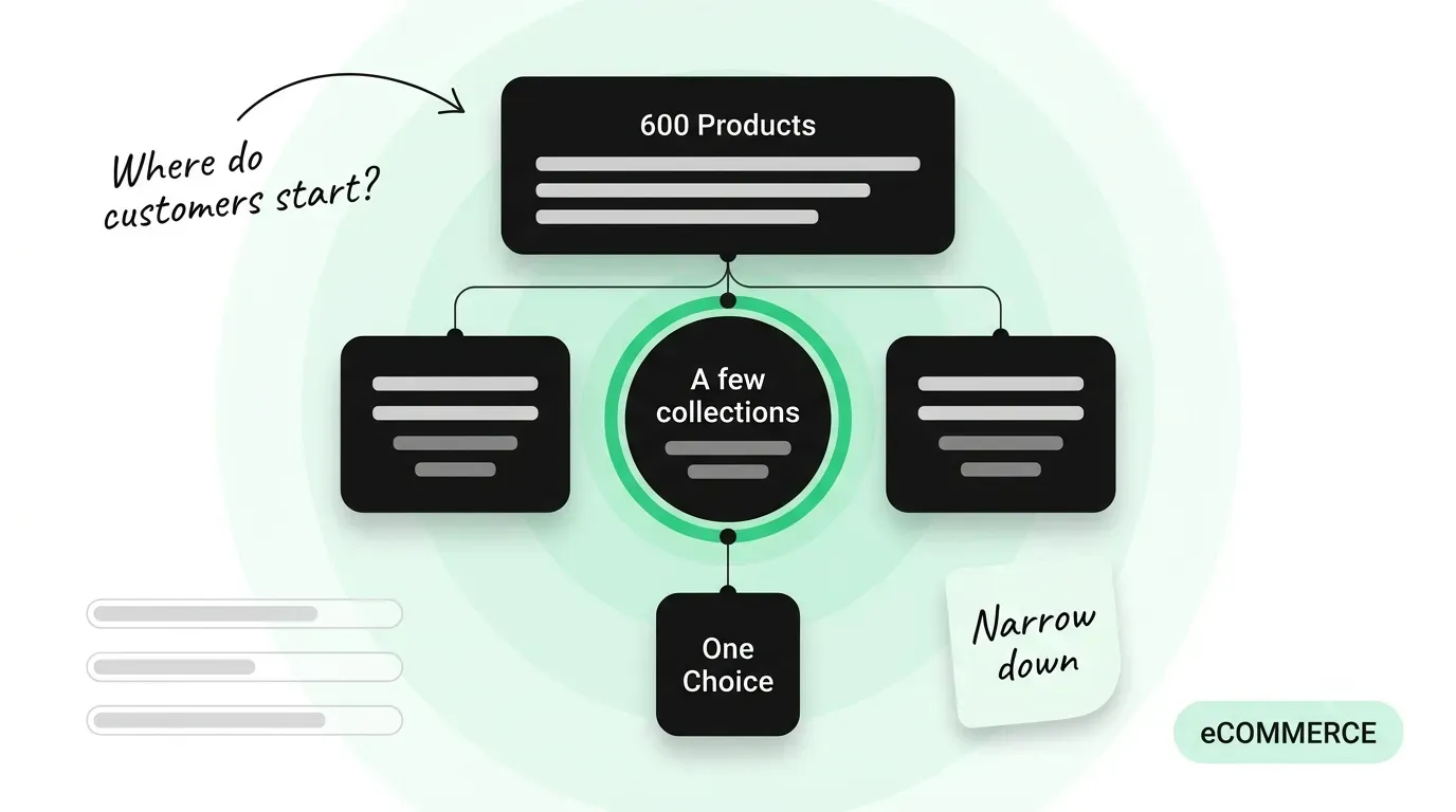
Most stores are built to show customers more products. Nearly every real buying decision works the other way: a customer arrives with a wide field and has to narrow it to one. Discovery gets the design attention, the filters get an afternoon near the end, and the part of the journey where the choice is actually made is the part nobody designed. The catalogue grows and the problem compounds.
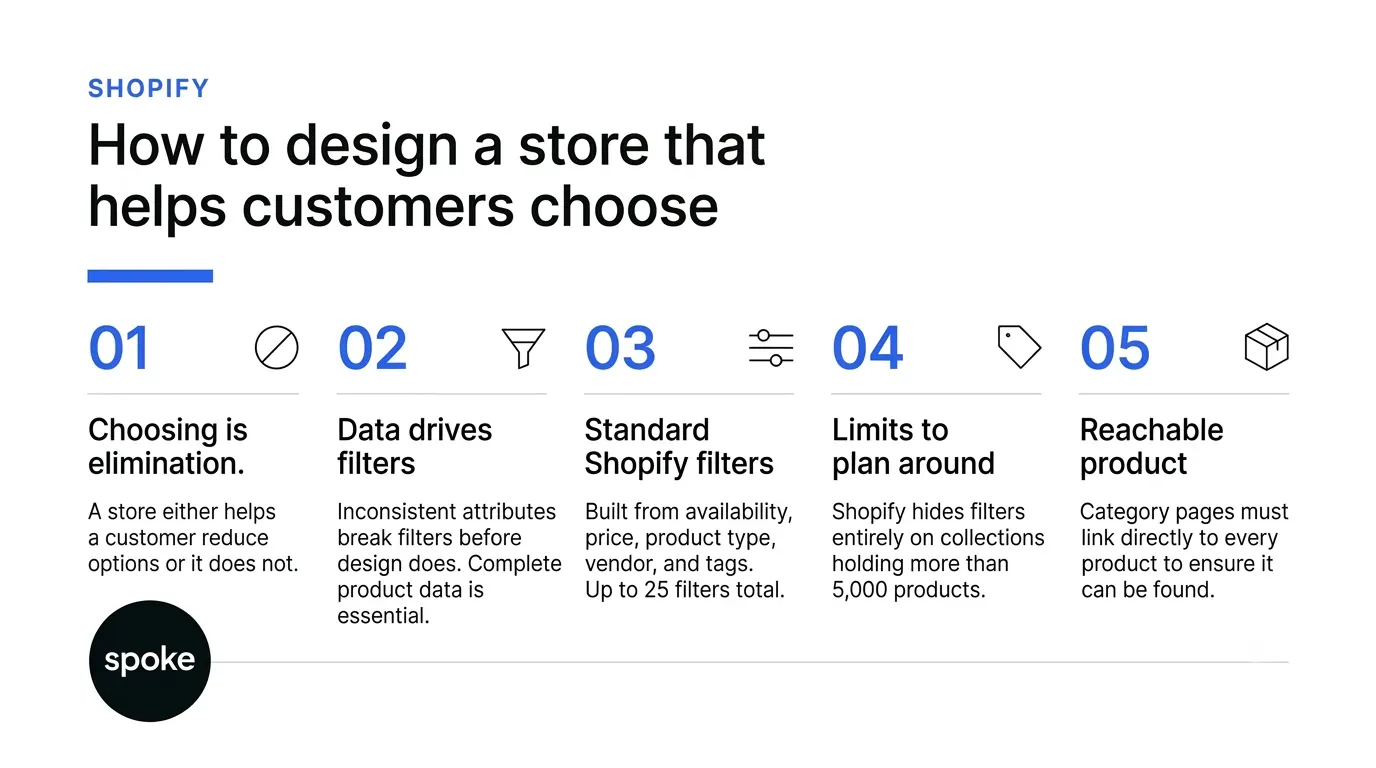
Watch what a customer actually does with a catalogue of two hundred items. They are not looking for more options. They are looking for a defensible reason to stop looking. Every step they take is a reduction, and the store either helps them reduce or it does not.
That reframes what the storefront is for. A customer who cannot eliminate anything has not been given a decision, they have been given a list. Recommendation carousels, best sellers and recently viewed all add to the field rather than cutting it, which is why a store can look busy and well merchandised while leaving the buyer no closer to a choice than when they arrived.
The practical consequence is that the mechanisms worth investing in are the ones that remove options with the customer’s consent: filters, comparison, and guidance that narrows by need rather than by attribute. Our Shopify development work starts from that view of the catalogue before any page is designed.
Filters look like an interface feature and behave like a data model. Shopify's documentation on storefront filters sets out what they can be built from: standard filters for availability, category, price, product type, tags and vendor, plus custom filters from product options, or product, category and variant metafields and metaobjects.
The limits in that documentation are the ones to plan around, because they arrive without warning. A store can have up to 25 filters in total. Each source can power only one filter across the whole store. Collections with more than 5,000 products do not display filters at all, and search results above 100,000 products hide them too. A single filter shows at most 100 values on the storefront, tags allow up to 5,000 unique values, and product options and attributes allow up to 1,000.
A worked version, illustrative rather than drawn from a client: a catalogue of 600 items carries a material value on 340 of them. Filtering by material looks like it works, returns plausible results, and silently hides 260 products the customer might have bought. The fix is not a design change. It is 260 rows of data entry, and knowing that before the theme is built is the difference between a week and a quarter.
A filter is only as good as the completeness of the field behind it. Where half the catalogue carries a material value and half does not, filtering by material silently removes products that may be perfectly suitable, and the customer has no way to know. Audit field completeness per attribute before building a filter on it, and leave the filter out until the data supports it.
Shopify’s own documentation covers this directly: only values that apply to the products in a collection or search result are shown, and for empty values an admin can hide them, move them to the end of the list, or leave them in default sort order. Where every value in a filter is empty, the whole filter is hidden. Choosing that behaviour deliberately is a five minute decision that most stores never make.
A collection is the entry point to a reduction, so the grouping decides which attributes a customer can even begin with. Shopify's documentation on collection types records the ceilings: up to 5,000 collections that use conditions, up to 50 that contain another collection, and up to 5 that exclude one. A product can sit in several collections, appears once within a collection even when added by more than one source, and exclusions override inclusions.
Those numbers are generous enough that nobody approaches them on purpose. They get approached one convenience collection at a time, and the cost arrives earlier than the ceiling does. A catalogue split across two hundred thin collections gives the customer more places to start and less help once they have started, because each collection is too small for filtering to do anything useful.
The sharper test is whether a collection is a place a customer would choose to begin. If it only exists because the merchandising team needed a way to group something internally, it can be a tag or a condition instead, without its own page competing for attention. The same structural discipline applies to any web design and development project.
Stores reach for one of these and treat it as the answer. They do different jobs at different points in the decision, and the cost column is where the planning actually happens.
|
Mechanism |
The question it answers |
Works best when |
The limit |
|---|---|---|---|
|
Filters |
Which of these do I rule out? |
Products differ on known attributes |
Hidden above 5,000 products in a collection |
|
Collections |
Where do I start looking? |
Customers arrive with a category in mind |
Only one filter per source across the store |
|
Comparison |
How do these two differ? |
The shortlist is down to two or three |
Needs attributes recorded consistently on every product |
|
Buying guide |
Which one is right for me? |
Customers lack the vocabulary to filter |
Goes stale quietly as the catalogue changes |
|
Product page detail |
Is this the one? |
The decision rests on specifics |
Nothing rescues a page the customer never reached |
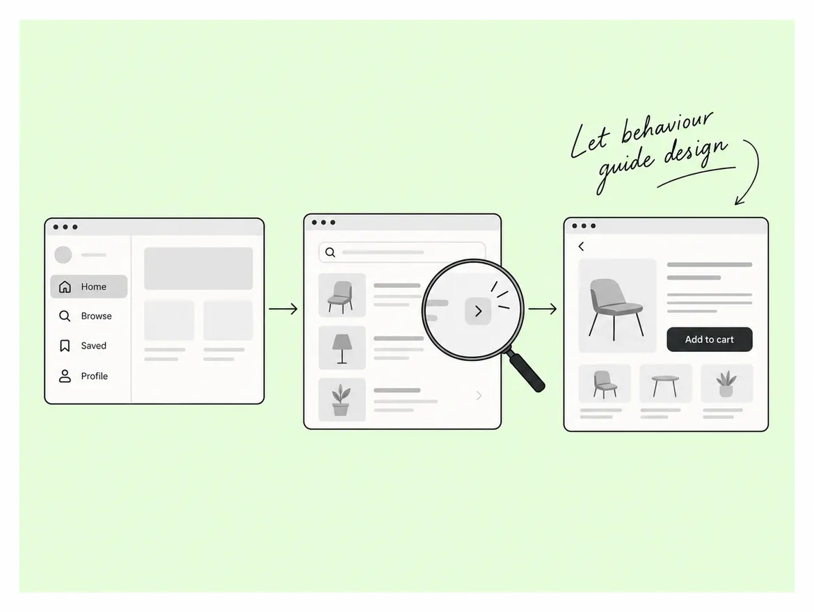
Read down the limits and a sequence appears. Collections and filters handle the early reduction, comparison handles the shortlist, and the product page closes it. A store that invests only in the last of those is optimising the step the customer reaches least often, which is the most common misallocation in a catalogue of any size.
None of this matters for a product the customer never arrives at. Google's guidance on store structure asks that category pages link directly to every product you want indexed, warns that products reachable only through a site search box may never be found because Googlebot does not submit searches, and asks for anchor tags rather than JavaScript events on navigation.
Addressing matters just as much once a shortlist exists, because comparing two options usually means opening both. Google's URL guidance for shopping sites asks for descriptive words rather than numeric IDs, gives each variant its own URL through either a path segment or a query parameter with the canonical pointing at the main product, and notes that fragment identifiers are not used for indexing, so two variants separated only by what follows the hash are one page as far as search is concerned.
The same guidance asks for one consistent URL form across internal links, canonical tags and the sitemap. That consistency is cheap to maintain from the start and expensive to retrofit once a catalogue has grown, which is the general shape of every structural decision in this piece. You can see how that plays out across builds in our case study library.
On a recent store rebuild, the filter set was agreed in the first week and the product data to support it turned out to be missing on two thirds of the catalogue. The build then waited on a data cleanup nobody had scoped or costed. Agreeing the filterable attributes before the theme would have surfaced that in the first conversation rather than the fifth week.
A guide written when the range held forty products quietly misdescribes it at four hundred, and nothing flags the drift because the page still loads. Give every guide an owner and a review date, and check it against the live range whenever a new product line is added rather than on a calendar.
A comparison view is only useful when every product carries the same fields with the same units. Where one product records a weight in grams and another in kilograms, or one leaves the field blank, the comparison makes the catalogue look careless at the exact moment the customer is deciding. Fix the data first and build the view second. More on that in our writing.
If you are launching, decide the filterable attributes before the theme, because filters are built from product data and retrofitting that data across a live catalogue is the expensive version of this work. If you are improving an existing store, start by auditing field completeness on every attribute you already filter by, since a filter running on half-populated data hides products the customer would have bought. And if the catalogue is large and the decision still feels hard, the missing piece is usually not another filter but guidance for customers who do not yet have the vocabulary to filter at all. If you want a second opinion on yours, talk to us.
Q: How many filters should a collection page offer?
A: Fewer than the platform allows. Shopify permits up to 25 filters across a store, but each one a customer has to read is a small cost, and filters on attributes customers do not shop by are pure noise. Start from the attributes that appear in customer questions and support tickets, and leave out anything that exists mainly because the data happened to be available.
Q: What happens to filters on a very large collection?
A: Shopify documents that collections with more than 5,000 products do not display filters, and that search results above 100,000 products hide them as well. Filter counts in search results are based on the first 1,000 results. If a collection is approaching that size, the structural answer is to split it into collections customers would actually choose between, rather than to accept a page with no filtering.
Q: Should every product variant have its own URL?
A: Only where the variant deserves to be found on its own. Google recommends either a path segment or a query parameter for variants, with the canonical pointing at the main product, and does not use fragment identifiers for indexing. Where a colour or size has genuine demand of its own, give it a real URL. Where it does not, keep it on the product page rather than creating addresses nobody needs.
Q: When is a buying guide better than more filters?
A: When customers do not yet have the vocabulary to filter. Filters assume the shopper knows which attribute matters to them, which is true for a replacement purchase and often false for a first one. A guide that asks about the situation rather than the specification reaches those customers, and it can hand them a filtered result at the end rather than a list.
Q: What should a shopify development agency decide before the theme?
A: The product data model and the collection grouping, because both constrain everything the theme can do afterwards. Filters are built from options and metafields, so the fields and their value consistency have to exist first. Agreeing the filterable attributes, the collection entry points and the URL form before any design work removes most of the expensive rework later.
Let’s Connect.
Have a project in mind or want to explore how we can help your business grow?