

July 19, 2022
Creative branding 101: Help you curate unique products & services.
Read Full

Most design systems are built the week before a launch and abandoned the week after. The reason is rarely the system itself. It is that the people who built it were designers solving a design problem, and the people who have to live with it are marketers trying to ship a page by Thursday. If the two groups never agreed what the system is for, the marketer works around it, and the system becomes a document rather than a tool.
Ask three people what a design system is and you get a color palette, a Figma file and a set of components. All three are outputs. The system is the set of decisions those outputs encode, and the value is that nobody has to take those decisions again on every page.
That distinction matters because of who uses it. A design system succeeds when a marketer can build a page without asking a designer a question, and it fails when every new page needs an exception. The test is not how complete the library looks. It is how many questions a page costs.
So the first artifact is not a palette. It is a list of the page types your team actually ships: landing pages for campaigns, product pages, a blog post, a case study, an event page. Count how many of those exist today and how many are one-offs. That ratio tells you whether you need a system or a tidy-up, and it is worth settling before anyone opens a design tool. The same question applies to any web design and development project.
Webflow's documentation on using a design system describes the parts: variables for reusable values such as color, font size and spacing, where changing the variable updates every place it is applied; classes and tags for styling; components for reusable elements with properties and synced updates; page templates that let non-designers build pages without breaking the system; and Shared Libraries for distributing all of it across sites in a workspace.
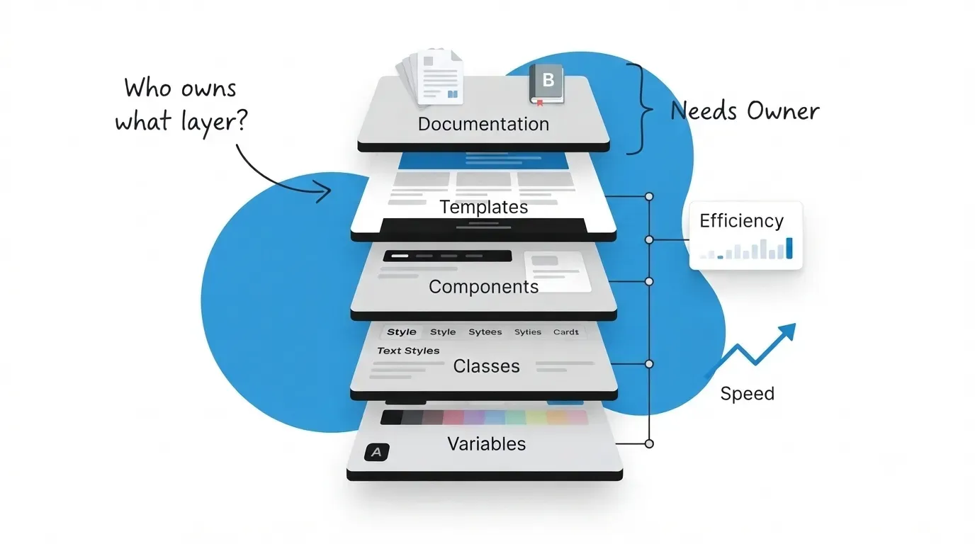
The order matters more than the list. Variables first, because components built on hard-coded values cannot be restyled later. Components next. Templates after that, because a template is an arrangement of components. Documentation last in sequence but not in importance, because it is the layer that decides whether anyone else can use what you built.
A component with a hex code typed into it is a component that will be rebuilt when the brand shifts. Webflow variables exist precisely so that a change happens in one place, and variable modes let the same component carry light and dark values or different values at a breakpoint. Define the values first, then build on them, even when the values are provisional.
A system that only a designer can operate solves the designer’s problem. Webflow’s own design system checklist separates the roles plainly: designers and site managers create and maintain styles, variables, components and templates, marketers build pages from existing components, and content editors update CMS content and component properties. Build for the middle role, because that is who uses it daily.
Accessibility usually arrives as a late review that generates a list of fixes. Two criteria are cheaper to encode in the system than to audit afterwards, and both are Level AA rather than the stricter AAA, so most sites are already committed to them.
W3C’s Success Criterion 1.4.3, Contrast (Minimum) sets 4.5:1 for normal text and 3:1 for large-scale text, where large means at least 18 point, or 14 point bold. It notes the ratios are thresholds rather than targets to round toward, so 4.499:1 fails. Logos and purely decorative text are exempt. Checking those pairs once while defining the palette costs an hour; finding them later means editing every page that used the failing pair.
W3C’s Success Criterion 3.2.4, Consistent Identification requires that components with the same functionality within a set of pages are identified consistently. Its examples are specific: a button labeled Search on some pages and Find on others fails, and so does a save action using a floppy disk icon in one place and a checkmark in another. Labels may still vary with context, so a link reading Page 4 on one page and Previous page on the next passes.
That second criterion is really a naming rule wearing an accessibility badge, and a component library enforces it almost for free. Where the library is bypassed, it is the first thing to break. Where motion is part of a component, it should be reused rather than rebuilt per instance for the same reason.
These are the layers in build order, who touches each one after launch, and what goes wrong when it is left out. The last row is the one teams skip and the one that decides whether the rest survives.
|
Layer |
What it fixes |
Who changes it |
The cost of skipping it |
|---|---|---|---|
|
Variables |
Color, type and spacing values |
Designer, rarely |
Every change becomes a find-and-replace across pages |
|
Classes and tags |
Default styling of elements |
Designer |
New pages drift from old ones within weeks |
|
Components |
Repeated blocks like nav and cards |
Designer builds, marketer places |
The same block exists in nine slightly different versions |
|
Templates |
Whole page layouts |
Marketer |
Every new page starts from a blank canvas or a copy |
|
Documentation |
When to use which |
Named owner |
The system is correct and nobody knows how to use it |
Read the last column and a pattern appears. The first four failures are visible: pages look wrong, and somebody notices. The documentation failure is invisible, because a system nobody understands still looks complete in the editor. That is why it is the one that reaches a year unnoticed.
Webflow’s checklist puts this first rather than last: identify who will use and maintain the system, set naming rules and document them, and create a style guide page or site as a single source of truth. Its final section asks you to define who can change shared resources, assign someone to keep documentation current, and assign someone to run regular audits.
Those are three distinct jobs and they often need three different people. The person who approves a new component is making a design decision. The person who keeps documentation current is doing maintenance. The person running audits is doing quality control. Giving all three to one busy designer is the same as giving them to nobody.
The cheapest version that works is a single page listing the components, when to use each, and one named person per job. It does not need a tool. It needs to exist somewhere the marketer shipping a page on Thursday will actually look. More on running that inside a live project in our writing.
On a recent build for a US software company, the component library was complete at handover and three months later the marketing team had created fourteen new classes outside it. None of them were malicious. Each one was a five minute workaround for a spacing value the system did not expose. Adding two spacing variables and a short page explaining which to use stopped the drift, and the fourteen classes were merged back in a morning. You can see the shape of that work in our case study library.
A page needs a slightly different spacing value, so someone adds a one-off class. Repeated across a quarter, the system now has a shadow system beside it. The fix is procedural: make the exception route explicit, so a marketer who needs something the system lacks knows who to ask rather than inventing it quietly.
A style guide built as a static page drifts the moment a component changes. Build it from the real components instead, so it cannot be wrong, and audit it on a schedule rather than when someone notices. A guide nobody trusts is worse than no guide, because it costs time before it is ignored.
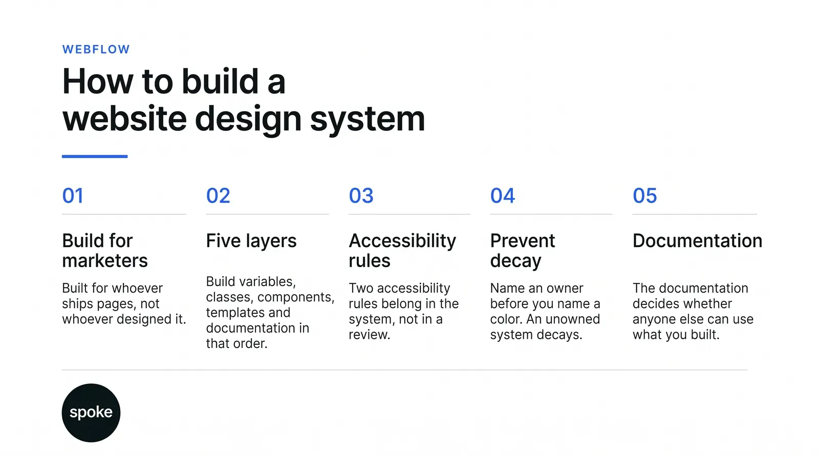
If you are starting from scratch, list the page types your team ships before you choose a single color, because that list decides how many components you actually need and stops you building a library for pages nobody makes. If you have a system that is not being used, the problem is almost never the components; check how many questions a new page costs a marketer, and fix whichever layer generates them. And if you have time for one thing only, name the three owners: who approves a new component, who keeps the documentation current, who runs the audit. That single decision outlasts everything else in this article. If you want a second opinion on yours, talk to us.
Q. How big should a design system be?
Ans. As big as the page types you actually ship, and no bigger. A library with forty components where the team builds four kinds of page is a maintenance burden pretending to be thorough. Start from the page list, build only what those pages need, and add components when a real page demands one rather than in anticipation of pages that may never exist.
Q. Should the design system live in Figma or in the site?
Ans. Both, with one of them named as the source of truth. Webflow recommends a style guide page or a dedicated design system site shared through a Shared Library. The failure mode is two systems drifting apart, each believed by a different team. Decide which one wins when they disagree, and write that decision down where both teams can see it.
Q. Who should own the system after launch?
Ans. Split it into three jobs rather than one. Someone approves changes to shared resources, someone keeps the documentation current, and someone runs periodic audits. Webflow’s checklist lists all three separately for good reason. One person can hold more than one job, but each needs a name against it, because an unnamed job is one nobody does.
Q. Do accessibility rules really belong in the system?
Ans. The two cheapest ones do. Contrast ratios are fixed numbers, so checking color pairs once while defining the palette prevents every later failure from that pair. Consistent identification of repeated components is close to automatic once a component library exists. Both are Level AA, which most sites already commit to, so encoding them costs less than auditing for them.
Q. What should a webflow design agency hand over besides the pages?
Ans. The variables, the components with their properties, the page templates a marketer can build from, and a written page saying when to use which. Ask for the naming conventions too. A handover that is only finished pages leaves you dependent on whoever built them, which is the opposite of what a system is for.
Let’s Connect.
Have a project in mind or want to explore how we can help your business grow?