
October 9, 2026
Shopify Seo: Which Parts Of Your Store Actually Affect Rankings
Read Full

Every page already has a hierarchy. Nobody decided most of it. It accumulated as sections were added by different people at different times, each one placed wherever there was room, and the result is a page whose order reflects the history of the organisation rather than the needs of the person reading it. The visitor cannot see that history. They just see a page where the important thing is fourth.
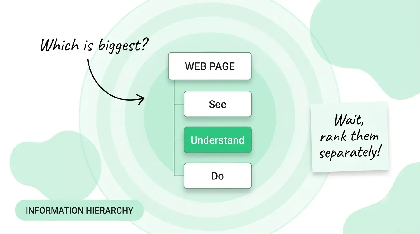
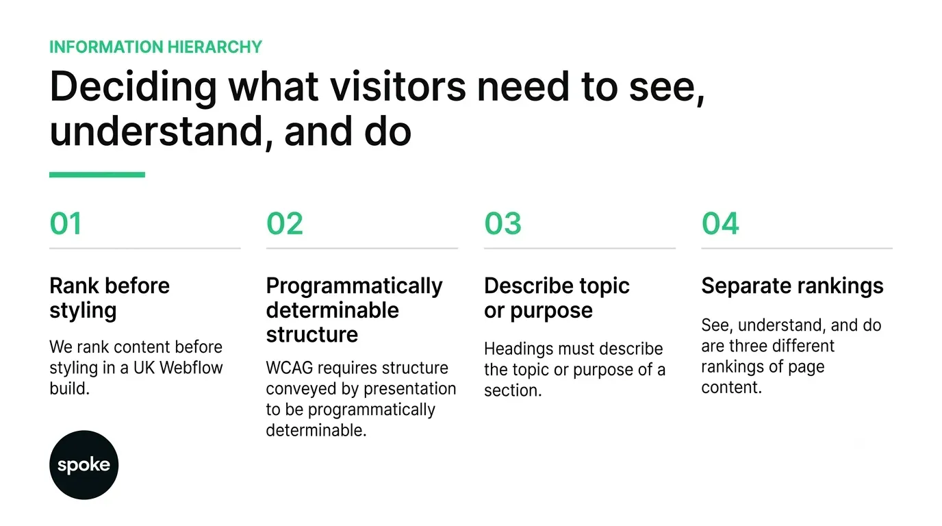
The phrase information hierarchy usually gets used to mean one thing: what is biggest. That is the smallest part of it. A page is doing three jobs at once and they have different orders. What a visitor needs to see is a scanning question, answered by weight and position. What they need to understand is a sequencing question, answered by what comes before what. What they need to do is a prominence question, answered by how obvious and how reachable the action is.
Conflating them produces familiar failures. A page that gets seeing right and understanding wrong is the one with a beautiful hero and a reader who still does not know what the company does. A page that gets understanding right and doing wrong explains everything well and buries the next step at the bottom. A page that gets doing right and seeing wrong puts a button in front of someone who has not been given a reason to press it.
So the first artefact is not a wireframe. It is three short ordered lists, one per question, written for a single page. Where the three disagree, you have found the real design problem, and it is better found on a page of notes than in a review. The same discipline carries into any web design and development project, whatever the platform underneath.
Worked through for a pricing page, as an illustration rather than a client example, the three rarely agree. See: the price, what each tier includes, who to contact. Understand: what the unit of pricing actually is, what drives a bill upward, what is excluded. Do: start a trial, or talk to someone about a larger plan. The understand list is the one most pricing pages skip, and it is the one that generates the support ticket.
A hierarchy that exists only in the styling is a hierarchy that disappears the moment the page is read by anything other than a pair of eyes. W3C’s Success Criterion 1.3.1, Info and Relationships, a Level A criterion, requires that information, structure and relationships conveyed through presentation can be programmatically determined or are available in text.
The intent section is specific about why. Sighted users rely on cues such as larger bold headings, bulleted lists and tabular rows to work out how content fits together, and those relationships have to survive when the presentation changes, whether that is a screen reader, a user stylesheet or a different device. Where a technology cannot convey a relationship programmatically, the guidance asks for a text description near the content.
This is the most common version of the failure and the hardest to see, because the page looks right. A section label set as large bold body text reads as a heading to a sighted visitor and as an ordinary paragraph to everything else, so the document outline is flat even though the design is not. It is also trivially fixable, which is why it is worth auditing before anything more ambitious.
Reordering with CSS is easy enough that it happens without much thought, usually to make a layout work at one breakpoint. The consequence is that a keyboard user meets the page in one order and a sighted user meets it in another. If the two orders have to differ, that is a decision someone should take deliberately and write down, not a side effect of a layout fix.
W3C’s Success Criterion 2.4.6, Headings and Labels is a Level AA criterion with a short requirement: headings and labels describe topic or purpose. Its intent is that users can grasp what a page contains and how it is organised, and it adds something most teams get wrong in the other direction, noting that a heading need not be long and that a word, or even a single character, may be enough when it gives the right cue.
That rules out two habits. Headings written as teasers fail, because a teaser withholds the topic. Headings padded out to balance a layout also fail, because the extra words dilute the cue. The criterion asks only that the heading say what the section is about.
Google’s SEO Starter Guide is worth reading alongside it, because it removes an argument rather than adding one. It states that heading order does not matter to Google Search, while adding that semantic order is excellent for screen readers, and that there is no ideal number of headings. The case for a clean heading structure is an accessibility and comprehension case. It is not a ranking case, and presenting it as one invites a push back you will lose.
Hierarchy is not one mechanism. It is five, read by different audiences, and each of them fails in its own way. Most hierarchy problems are one signal being asked to do a job that belongs to another.
|
Signal |
What it ranks |
Who reads it |
The limit |
|---|---|---|---|
|
Heading levels |
How sections nest |
Screen readers, crawlers, scanners |
Carries no weight if headings are styled text |
|
Visual weight |
What the eye reaches first |
Sighted visitors only |
Invisible to anything that does not render the page |
|
Source order |
What is encountered first |
Keyboard and screen reader users |
Can disagree with the visual order after CSS reordering |
|
Position on the page |
What is seen without scrolling |
Everyone, unevenly |
Changes with viewport; nothing is reliably above the fold |
|
Link text |
What the next step is |
Visitors and crawlers |
Fails when several links read the same |
The pattern in the limit column is that every signal has an audience it does not reach. Visual weight does nothing for a screen reader. Heading levels do nothing for someone scanning at speed. A page that leans entirely on one of them has decided, usually without noticing, which visitors it is prepared to lose.
Above the fold is a weaker idea than it was, because the fold moves with every device. The useful question is not what fits on the first screen, but what a visitor must have encountered before the next section makes sense.
Where that is settled, the page can afford to be long. Where it is not, length is what kills it, because a reader who has not been given the premise will not scroll looking for it. Scroll depth measures patience, not comprehension, and reading it as comprehension is how teams conclude that a confusing page is working. You can see how that plays out across a body of work in our case study library.
Where sections reveal on scroll or animate into place, the hierarchy has a time dimension as well as a spatial one, and it should reinforce the order you chose rather than invent a second one.
On a recent UK marketing site, the rendered heading outline came back flat under a page everyone agreed looked well structured: nine section labels, every one of them styled body text rather than a heading element. Correcting the outline took a morning and changed nothing visually. The screen reader walkthrough that had been failing for two quarters passed on the first attempt afterwards.
Whoever owns a new message wants it seen, and the top is where seen happens. Two quarters of that and the page opens with four competing claims and the original one has moved to the middle. The fix is procedural rather than editorial: a written rule that adding a section means naming which existing section it outranks, and why.
A page built once with correct heading levels will drift as editors add content through a rich text field, where the obvious way to make something stand out is bold and bigger. Give editors the real heading option in the editor, and check the rendered outline rather than the visual design when auditing. More on running that check inside a live project in our writing.
If you are planning a new page, write the three ordered lists before anything is designed, because reconciling see, understand and do on paper costs an afternoon and reconciling them in a built page costs the build. If you are auditing an existing page, start with the rendered heading outline rather than the design, since a flat outline under a well-structured-looking page is both the most common defect and the cheapest to repair. And if the page is fine but drifting, the problem is not the hierarchy, it is that nobody owns it: write down who approves a new section and what it has to outrank. If you want a second opinion on yours, talk to us.
Q. Is information hierarchy the same as visual hierarchy?
A: Visual hierarchy is one part of it, covering what the eye reaches first through size, weight, colour and position. Information hierarchy also covers the order in which ideas are encountered and how clearly the next action is signalled. A page can have excellent visual hierarchy and still leave a reader unable to explain what the product does, because seeing and understanding are ranked separately.
Q. Does heading structure affect our rankings?
A: Google’s SEO Starter Guide states that heading order does not matter to Google Search and that there is no ideal number of headings. It does say semantic order helps screen reader users. So the argument for fixing a heading structure is comprehension and accessibility, and WCAG makes it a conformance requirement. Arguing it as a ranking factor overstates what Google has actually published.
Q. How many levels of heading should a page use?
A: As many as the content genuinely nests, and no more. Levels exist to express containment, so adding a level that contains one subsection expresses nothing. If a page needs four levels to stay coherent, the more likely problem is that it covers two topics and should be two pages, which is a structural question rather than a heading question.
Q. What should a webflow designer uk teams hire be responsible for here?
A: The ranking decisions belong with whoever understands the buyers, which is usually not the designer alone. What the build side owns is making sure the chosen order survives: real heading elements rather than styled text, a source order that matches the visual one unless a deliberate exception is recorded, and an editing model that does not let the structure decay as content is added.
Q. How do we check the hierarchy is actually working?
A: Read the headings alone, in order, with the body text hidden. If that list reads as a coherent summary of the page, the structure is sound. If it reads as a set of teasers or disconnected labels, visitors scanning the page are getting nothing from it. Follow that by tabbing through the page to confirm the encounter order matches what you intended.
Let’s Connect.
Have a project in mind or want to explore how we can help your business grow?