
July 13, 2022
Advice businesses coming up with new product design ideas should never neglect.
Read Full

The usual fix for a confusing product page is more words. Another paragraph of explanation, a longer feature list, one more diagram, a glossary nobody asked for. The page gets heavier and the reader understands less, because the problem was never a shortage of information. It was that the first screen asked the visitor to already know things they do not know yet.
There is a difference between a visitor who cannot follow your sentences and one who follows every sentence and still cannot say what the product is for. The second failure is the harder one to catch, because nothing on the page looks broken. The words are correct, the design is clean, and the reader leaves anyway.
What they were missing was a premise. Every explanation assumes something the reader already believes, and a page written by people who use the product daily assumes a great deal: that the category exists, that the problem is worth solving, that the reader has felt the pain being described. Here is the same product described both ways, as an illustration rather than a client example.
Before: "An AI-powered contract intelligence layer that operationalizes policy compliance across the supplier ecosystem." After: "Find the clauses in a supplier contract that breach your own policy, before you sign it." Nothing was simplified away. The second version supplies the premise the first one assumed.
Finding your own version of that gap takes an afternoon with the last twenty inbound inquiries. Read each one for what the sender already knew and what they asked you to explain. The questions that repeat are the premises your page is skipping. The same discipline applies to any web design and development project, though it bites hardest where the product is hard to describe.
A first screen can do one job well or three jobs badly. Nielsen Norman Group describes progressive disclosure as showing only the few most important options first, then offering the specialized set on request, with everything users frequently need disclosed up front. It points at frequency-of-use data and usability testing to decide which is which.
Borrow the test rather than the interface pattern. Something belongs on the first screen if a visitor frequently needs it, not because a stakeholder wants it there. That turns the argument over what goes above the fold into a research question with an answer.
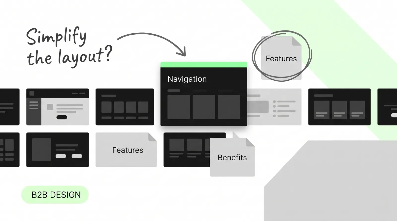
Five teams each get their sentence in the hero, and the result opens with the category, pivots to an outcome, name-checks the mechanism and ends on a comparison. Each clause is defensible and the sequence is incoherent. Pick the one lead the page is built on, and move the other four down the page where they can be developed properly.
Below, each approach is written out for the same invented product, a tool that checks supplier contracts against a company policy. The lines are illustrative, not drawn from a client.
|
Approach |
Opening line for the same product |
Suits |
The cost |
|---|---|---|---|
|
Category |
"Contract review software for procurement teams." |
Buyers who know the category |
Says nothing about why yours differs |
|
Outcome |
"Stop signing supplier contracts on terms you would have renegotiated." |
Unfamiliar or invented categories |
Reads as a claim until proof follows |
|
Mechanism |
"We check every contract against your own policy and flag what breaches it." |
Technical and legal evaluators |
Asks most of a reader who has not bought the premise |
|
Comparison |
"The clause review your legal team does by hand, on every contract." |
Crowded categories |
Frames the page around a competitor |
|
Demo |
A clip of a contract being marked up, with a caption naming what is happening |
Value visible in one action |
Means nothing without the caption |
There is no free lead. The question is which cost your buyers can absorb, and that turns on whether they arrive knowing the category exists. For an invented category, the mechanism line asks the most of them, because it describes how something works before they have agreed it needs doing.
Two accessibility criteria are useful here, and both are Level AAA, which most marketing sites do not target. Treat them as a borrowed bar rather than an obligation. What makes them worth borrowing is that they turn a taste argument into a stated threshold.
W3C’s Success Criterion 3.1.3, Unusual Words asks that a mechanism be available for identifying definitions of words used in an unusual or restricted way, including idioms and jargon. Its guidance declines to exempt new or invented words, and encourages authors writing specialized content for non-specialists to meet it even when they are only claiming A or AA conformance. In practice that means defining the term inline at its first use, not building a glossary nobody visits.
W3C’s Success Criterion 3.1.5, Reading Level asks that where text requires reading ability beyond the lower secondary education level, a simpler version or supplemental content be available. The standard asks you to try making the text more readable first, which is the reverse of the usual instinct to write an explainer page. When a page fails it, sentence length is worth checking before vocabulary.
The hero gets the attention, but a complex product is rarely decided on one page. Three structural choices follow from the premise you settled on.
A product with several use cases can be arranged by use case, by job role, or by product area. Only one of those matches how buyers arrive, and the other two force a translation step. Check which axis appears in inbound questions before choosing, and resist running two axes at once, which duplicates every page underneath.
Logo strips and testimonial carousels collect proof in one place, which is the one place it does least. A claim is believed where it is made, so the evidence belongs beside it: the integration named in the sentence that promises compatibility, the number next to the outcome it supports.
Security posture, integration specifics and implementation effort each block a different reviewer, and none of them fits in a bullet. Give each one an addressable page that can be sent to the person who asked, rather than a line on the product page that satisfies nobody. Interface motion can carry some of this, but only with a caption that names what is happening.
Google’s guidance on helpful, people-first content is a useful external check because it is not about writing. Its self-assessment asks whether readers finish with enough knowledge to reach their goal, and whether the content leaves them needing to search again for better information. That second question is the one to run against a product page.
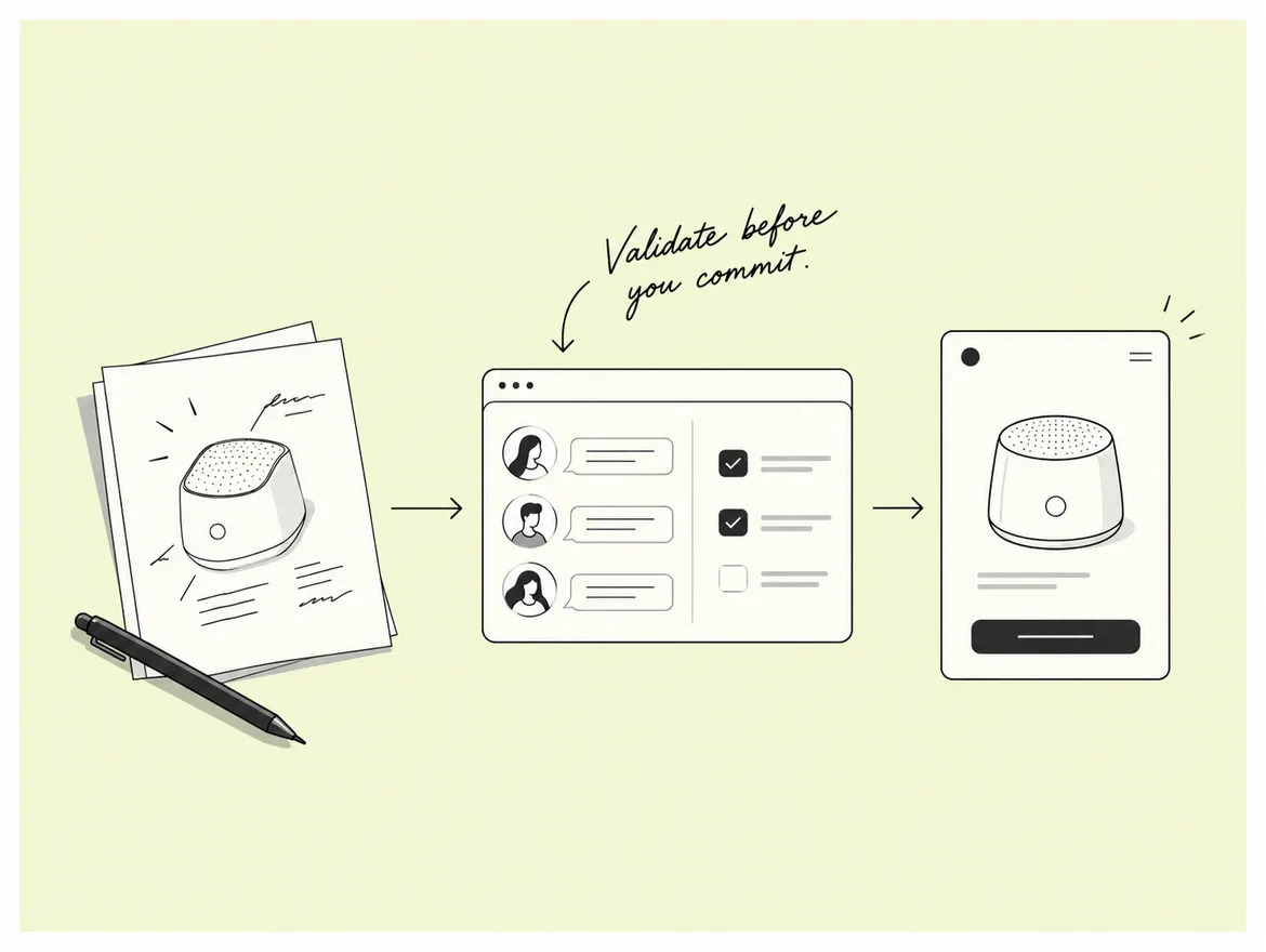
Here is a repeatable version that needs no budget. Give the page to five people outside your category. Let each read it once, take it away, then ask two questions: what does this product do, and who is it for. Write down the answers verbatim.
Interpreting the results is the part teams skip. If three or more cannot name what the product does, the premise is missing and no rewrite of the sentences will help. If they describe the product but not the buyer, the page is talking to everyone. If they describe a competitor, the opening approach is wrong rather than the wording. More on running these inside a live project in our writing.
On a recent build for a logistics software company, the homepage opened with the category, and almost every demo request still asked what the product replaced. Moving the comparison line into the hero and pushing the category description down one section cut that question out of the next quarter of inquiry notes. The copy did not get shorter. The order changed. You can see the shape of that work in our case study library.
A visitor evaluating a purchase has to answer questions the product description does not touch: what it will take to run, who approves it, what happens if it goes wrong. A page covering only capability sends all of those to a human, and most never get asked because the visitor leaves instead.
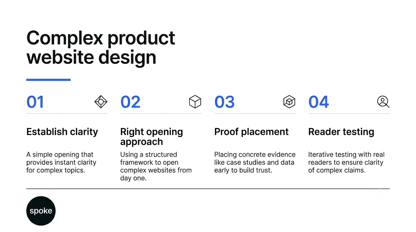
If you are writing a new page, settle two things before anyone opens a design tool: which premise your reader arrives with, and which single approach the page opens on. Those two decisions do more for comprehension than any amount of rewriting afterwards. If you have an existing page that is not landing, run the five-reader test before the rewrite, because it tells you whether the problem is the premise, the audience or the opening, and those need different fixes. And if the product is decided across several pages rather than one, spend the time on where proof and evaluation detail live, which is where most complex products lose the reviewer who was never going to call you. If you want a second opinion on yours, talk to us.
Q: How long should a B2B product page be?
A: Length is the wrong control. A long page that sequences well reads faster than a short one that assumes a premise the visitor does not hold. Decide what the first screen must deliver, then let the rest run as long as the questions a buyer genuinely has, with each section answering one of them completely rather than half-answering several.
Q: Should we explain the category before the product?
A: Only when the category is unfamiliar or invented. If buyers already search for it by name, explaining it wastes the first screen and sounds condescending. If they do not, skipping it means every later sentence rests on a premise the reader has not accepted. The inbound inquiries tell you which situation you are in faster than any survey would.
Q: Do we have to meet the WCAG criteria mentioned here?
A: Not unless you are targeting Level AAA, which both of those criteria sit at and which most marketing sites do not claim. They are quoted here because they give a stated threshold for two arguments that otherwise run on taste. W3C itself encourages authors writing specialist content for general readers to meet the jargon criterion even at A or AA.
Q: Where should proof and security information go?
A: Beside the claim it supports, and on its own addressable page where a reviewer needs the detail. A logo strip proves that companies bought something, not that your integration works. Security and implementation detail each block a specific person in the buying group, and that person needs a link they can open, not a reassuring bullet on the product page.
Q: What should a webflow design company handle versus our own team?
A: Sequencing and structure are a joint decision, because they depend on knowing your buyers. Implementation, component structure and the editing model afterwards are the build side. The split worth insisting on is that nobody hands over a page without recording which approach it opens on, since a later editor who does not know that will reintroduce the wall of text within a quarter.
Let’s Connect.
Have a project in mind or want to explore how we can help your business grow?