

August 3, 2022
How to create a goal-oriented product design brief?
Read Full

Most stores that ask us for help with this have already installed three apps and changed a button colour twice. Nothing moved, and nobody can say why, because the store does not get enough weekly orders for a test to mean anything. The uncomfortable part is that almost every problem we find was decided at build time and is sitting in plain sight. It is not a testing problem. It is a list of known defects nobody has worked through.
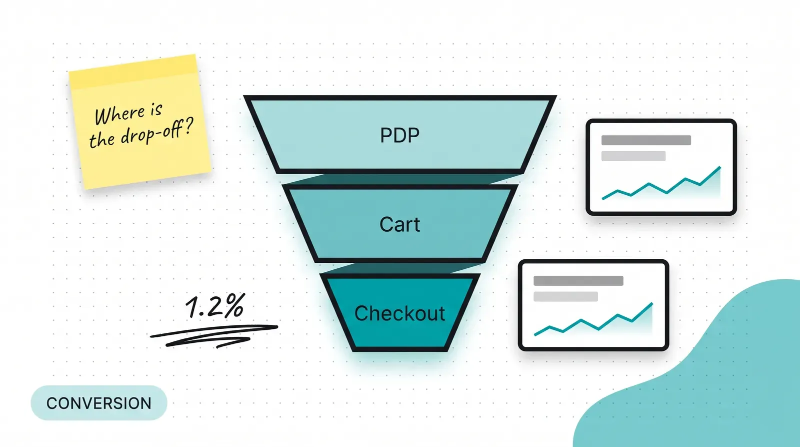
It is mostly not optimisation, and calling it that sends teams to the wrong tool. Shopify conversion rate optimization, as the phrase is usually sold, implies a loop: form a hypothesis, split the traffic, wait for significance, keep the winner. That loop assumes you have enough orders a week for the maths to settle before the catalogue changes underneath it, and most stores we see do not.
A store doing a few hundred orders a month would need to run a single test for months to separate a real difference from noise, by which time the product range, the pricing and the season have all moved. A test you cannot finish is not evidence, it is a delay with a dashboard attached. What works instead is unglamorous: take the known, documented reasons people abandon purchases, check your store against each one, and fix the ones that apply. That is design and build work, and our Shopify build work is scoped around it rather than around experimentation.
You do not need your own data to find the first ten problems. Baymard's abandonment research puts the average documented cart abandonment rate at 70.22 per cent across fifty studies, and lists the reasons people give once the browsers are excluded. Extra costs such as shipping, tax and fees being too high accounts for 40 per cent. Delivery being too slow accounts for 20 per cent. Distrust of the site with card information is 19 per cent, being forced to create an account is 18 per cent, and a checkout that was too long or complicated is 17 per cent. Website errors or crashes also sit at 17 per cent, and 12 per cent say they could not see or calculate the total order cost up front.
Read that list as a defect register rather than as statistics. Six of those eight are decisions somebody made on your store, and five of the six are reversible in a week. Nothing on that list requires a test, because the reason is already stated by the people who left.
The largest single cause is also the easiest to get wrong without noticing, because internally everyone already knows what shipping costs. A customer who sees a price on the product page, adds to cart, and then discovers a delivery charge and a handling fee at the final step has been told something different twice.
The fix is not a discount. It is telling them the landed total earlier: the delivery charge stated on the product page where it is predictable, a threshold shown as a specific figure rather than as "free shipping on larger orders", and any cash-on-delivery fee named before the cart rather than inside it. Where the charge genuinely varies, say what it varies with. A buyer forgives a range they understood in advance and does not forgive a number that appeared at the end.
A product page has one job, which is to let somebody decide without opening another tab. Most of what prevents that is content-model work rather than layout work, and it is settled when the store is built. The fields that matter are the ones a buyer would otherwise have to ask about: what is physically in the box, the dimensions and weight, what the variants actually differ by, whether the thing is in stock now or on a two-week lead, and what happens if it does not suit. Those belong in structured fields on the product, not typed into a description by whoever added the item, because a description is where information goes to become inconsistent across two hundred products.
Variant selection is the next decision, and it is where theme defaults quietly cost orders. A dropdown with nine entries hides the fact that six are out of stock until the buyer picks one. Swatches with a disabled state say the same thing in one glance. A customer who picks an unavailable variant twice has learned that your store wastes their time. Our ecommerce design service treats the variant display and the stock state as a build decision rather than a theme setting, because changing it later means touching every product template.
Reviews and delivery estimates are the last pair. Both answer a question that is being asked at that exact moment, and both are routinely placed at the bottom of the page where the decision is already over. A star rating next to the price and a delivery window next to the add-to-cart button do more than a longer description will.
Almost nothing good happens on the cart page, and a surprising amount of effort gets spent there. The buyer has already decided; they are checking the total and the quantity before committing. What that page owes them is an accurate landed cost, an obvious way to change a quantity or remove a line, and a clear route forward. Upsell blocks, recommendation carousels and promotional banners all compete with the one action the page exists for.
Two things are worth adding and almost nothing else. The first is the delivery estimate repeated, because it is the question that resurfaces when the total appears. The second is whatever payment reassurance your market needs, which in India usually means making it visible that cash on delivery exists and what it costs before the buyer reaches the payment step. Custom store design work usually means removing things from this page rather than adding them.
This is where plans meet the platform, and a lot of advice written before 2024 is simply wrong now. Shopify's checkout.liquid deprecation notice set out the change: customisations made through checkout.liquid on the Information, Shipping and Payment pages stopped working on 13 August 2024, and checkouts not upgraded to checkout extensibility by that date were moved automatically to the standard, uncustomised Shopify Checkout. The Thank You and Order Status pages were given no deadline in that post, with Shopify saying extensibility support for them would follow.
The practical consequence is that checkout is now configured and extended rather than coded. You get the settings Shopify exposes, plus whatever extensions and apps you add through the supported route. That is a narrower surface than agencies used to promise, and it is a better one, because the parts you can no longer break are the parts that used to break.
One behaviour is worth knowing because it changes how you read your own numbers. Shopify's one-page checkout documentation states that the cart is checked against inventory levels when a customer completes a checkout step, and that inventory is held only when the customer submits their payment information, with the hold released if the payment fails until they return to the payment method page. An order that fails at payment is not a design problem, and chasing it as one wastes a month.
The commonest scoping failure we see is a checkout requirement agreed in a kickoff meeting that the platform will not allow. A custom field, a conditional message, an extra step for a specific product type: each of these is possible or impossible depending on the plan and the extension route, and finding out in week six is expensive. Settle the checkout requirements against the platform's actual capability before the design is signed off, not after.
Most of this article argues against testing, so it is worth naming the part that is measurable today. Google's guidance on INP defines Interaction to Next Paint as how quickly a page visually responds to clicks, taps and key presses across a visit, and sets the thresholds at the 75th percentile of field data: 200 milliseconds or less is good, above 200 and up to 500 needs improvement, and above 500 is poor.
That is a number you can read from field data rather than argue about. On a Shopify store the usual causes are the same three: too many apps injecting scripts into every page, a theme loading its full JavaScript bundle on the product template, and images served larger than they are displayed. Every app you install is a permanent tax on every page, paid by every visitor, including the ones who never use the feature. Audit the app list before buying another one, and read the apps you already have as a cost rather than as capability.
|
Where to spend the effort |
When it is worth doing |
What it costs you |
|
Showing the landed total early |
On any store with delivery charges, handling fees or cash on delivery |
A theme change plus an honest shipping-rate setup, which is operations work before it is design |
|
Leaving guest checkout switched on |
When repeat purchase is low or the catalogue is bought rarely |
You lose the account signup you were using to build the customer list |
|
Rebuilding the product content model |
Before launch, or at the next theme change, never between the two |
Editorial time across the whole catalogue, which scales with product count |
|
Adding checkout extensions or apps |
When you genuinely need a field or message the standard checkout lacks |
App fees plus a dependency to re-test at every platform release |
|
Speed work on the product template |
When field INP sits above 200 milliseconds |
Developer time, and usually removing an app somebody asked for |
Four recur across almost every store we audit, and none of them is a design flaw in the usual sense.
The first is treating a discount as a fix. A code offered at the point of abandonment teaches buyers to abandon, and it hides the defect rather than removing it. The second is forcing account creation, which the research names directly and which almost always exists because somebody wanted the email address rather than because the buyer needed an account.
The third is running an A/B test on a store without the volume to resolve it, then declaring a winner from a difference that was noise. The fourth is installing an app for each symptom until the product page carries eleven scripts, at which point the speed problem you created outweighs every feature you bought. Longer write-ups on several of these sit on the Spoke blog.
Honest limits are worth stating, because the alternative is pretending every question has a measurable answer. We do not test copy tone, brand photography or the ordering of sections on a low-volume store, because the effect size is smaller than the noise and the test will never resolve. We do not test anything that a documented cause already explains, because fixing it is cheaper than proving it. And we do not run tests across a seasonal peak, where the traffic mix changes enough that the result does not carry into the rest of the year.
Where a store genuinely has the volume, testing earns its place on the questions that reasoning cannot settle: price presentation, bundle composition, the number of steps in a configurator. Everything above that line is a decision, and a decision is cheaper to make well than to measure badly. Finished store builds are worth reading with that split in mind.
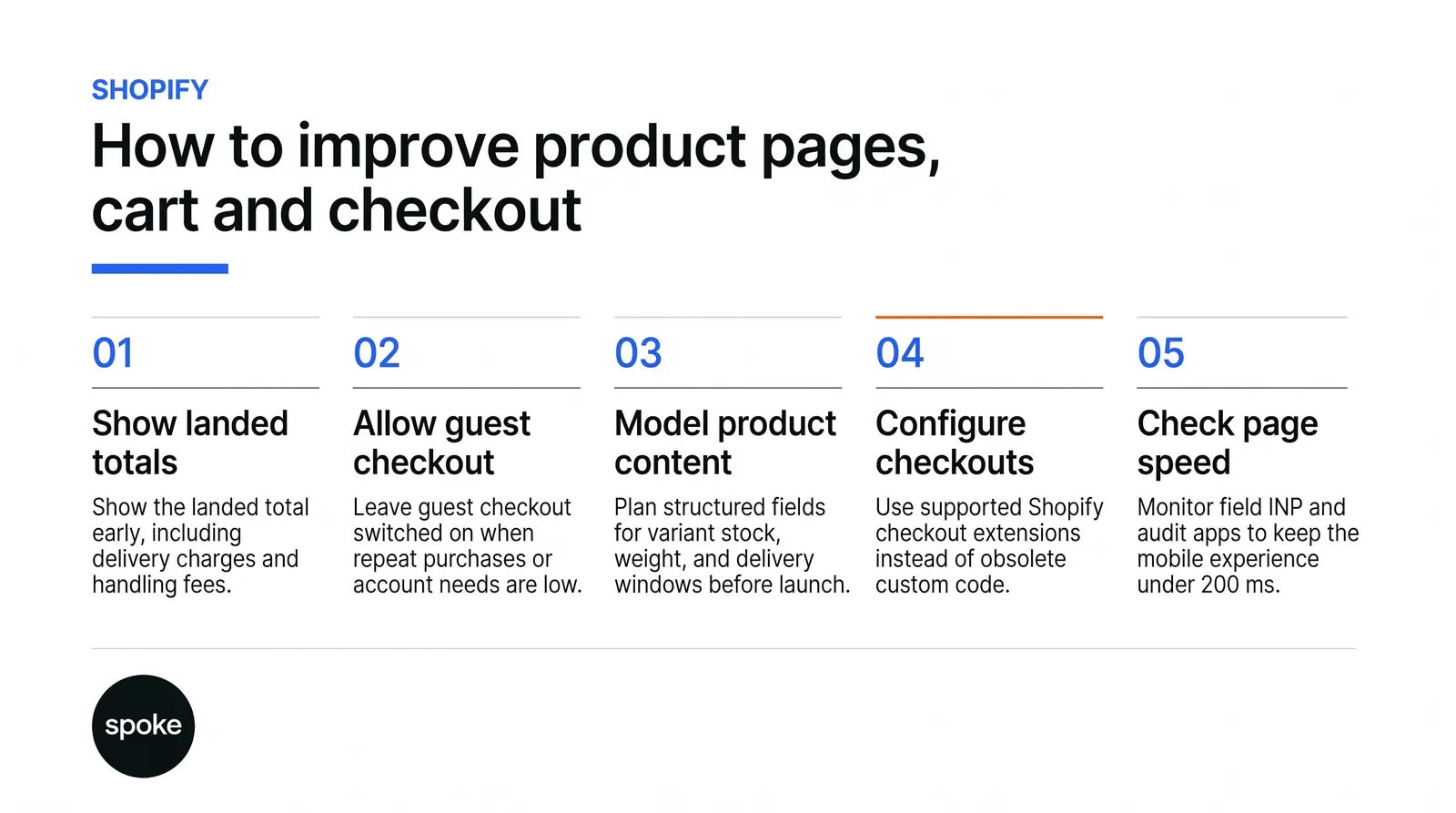
If your store takes fewer than a few thousand orders a month, stop planning tests and work through the documented list instead. Show the landed total early, leave guest checkout on, put stock state and delivery windows where the decision happens, and get field INP under 200 milliseconds. That is what shopify conversion rate optimization looks like at your volume, and most of it is a fortnight of build work rather than a quarter of experimentation.
If you do have the volume, keep the defect list as the floor and spend your testing budget only on the questions reasoning cannot answer. A shopify development company india brands trust should be willing to tell you which of those two situations you are in before quoting. If you would like that assessment before anything is built, talk to the team and bring your order numbers rather than a competitor's site.
Q: How many orders do we need before A/B testing is worth it?
A: Enough that a realistic difference shows up inside a few weeks rather than a few quarters. As a working rule, if a test would need more than a month to resolve, the catalogue, pricing or season will have changed before it finishes and the result will not be trustworthy. Below that line, spend the same effort on the documented causes of abandonment instead.
Q: Should we switch to one-page checkout or keep three pages?
A: Treat it as a platform setting rather than a strategy, and change one thing at a time if you switch. The more useful detail is behavioural: inventory is only held once the customer submits payment information, so a drop between the final step and the order is often a payment failure rather than a design problem. Check that before redesigning anything.
Q: Is cash on delivery hurting our numbers?
A: It depends on whether the cost of it is visible early. Buyers abandon when extra costs appear late, so a cash-on-delivery fee introduced at the payment step behaves like any other late charge. Naming the fee on the product page and in the cart usually matters more than whether you offer the option at all.
Q: Can we still customise the checkout the way our old agency did?
A: Not through checkout.liquid on the Information, Shipping and Payment pages, which stopped working in August 2024. Customisation now happens through checkout extensibility, which means settings, supported extensions and apps rather than arbitrary code. Confirm what your specific requirement needs before it is agreed in a scope, because the answer depends on your plan.
Q: Our pages feel fast on the desktop. Why would speed be a problem?
A: Because the metric is measured from real visits on real devices, at the 75th percentile, and your office connection is not representative. A product page that responds instantly on a laptop can sit well above the 200 millisecond threshold on a mid-range phone on mobile data, which is how a large share of Indian traffic arrives. Read field data, not your own experience.
Let’s Connect.
Have a project in mind or want to explore how we can help your business grow?