
October 17, 2026
When Should You Simplify Your B2b Website Structure Instead Of Adding More Pages?
Read Full

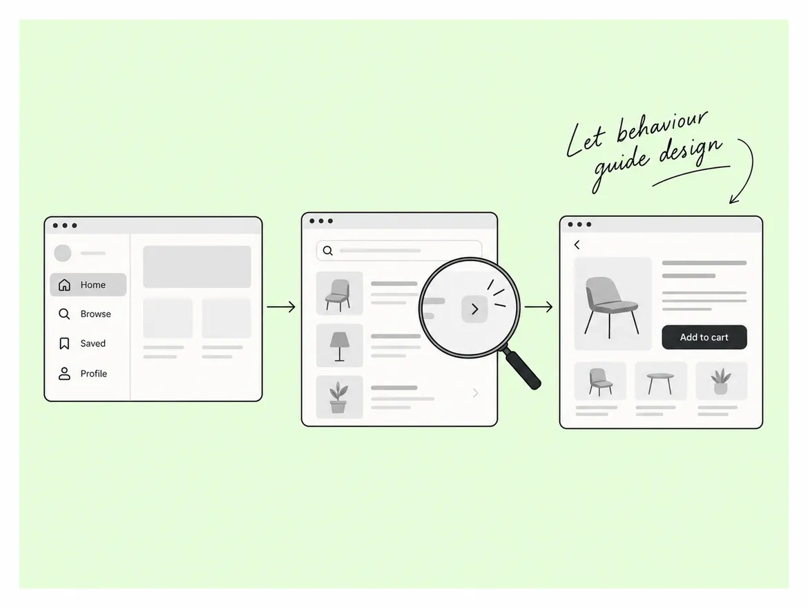
Most B2B rebuilds begin with a sitemap that mirrors the org chart. Sales gets a section, product gets a section, marketing takes the resource library, and whatever is left becomes "Company". It makes complete sense to the people who drew it, which is precisely the problem: none of them will ever need it to find something whose location they do not already know. A buyer arriving cold from a search result has no idea which internal team owns the answer.
The word "architecture" sends teams straight to the navigation bar, and the rebuild turns into an argument about dropdowns. That argument sits downstream of the actual work. Website information architecture is the system that decides what content exists, how it is grouped, what each group is called, and how a person moves between groups. Navigation is one rendering of it. URL structure, breadcrumbs, internal links and the sitemap are others. When the model underneath is wrong, redesigning the dropdown treats the symptom.
B2B makes this harder than most categories for one structural reason: the people who need the site do not share a question. A technical evaluator wants integration detail. A finance reviewer wants commercial terms and a clear picture of risk. The person who will use the thing wants to know whether it makes their week easier. Procurement wants compliance documentation. They do not arrive together, they rarely arrive on the homepage, and most form a view before anyone at your company knows they exist.
There is a cheap test for this and it needs no research budget. Take six questions real buyers asked your team last quarter. Answer each one using only the navigation, starting from the homepage, with site search turned off. Count the dead ends. On most complex B2B sites that count is high enough to end the dropdown argument in one sitting.
It also reframes what the project is for. A structure that works is not a design achievement; it is clearer customer communication delivered through the only channel most buyers use. The same discipline applies to any web design and development project, not only the ones built on a particular platform.
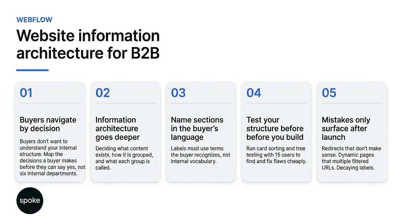
The first artifact should not be a sitemap. It should be the decisions a buyer has to make before they can say yes, in their words and in roughly the order they face them: do we have this problem, is this category the right answer, what will it cost in time and people, will it work with what we already run, who approves it, and what happens if it goes wrong. Six decisions, not six departments.
Group your existing content against that list and two things fall out. Some decisions have five pages competing to answer them, which is where cannibalization starts. Others have nothing at all, and those gaps are the expensive ones, because the buyer leaves to find the answer elsewhere. Neither is visible on a sitemap drawn by the department.
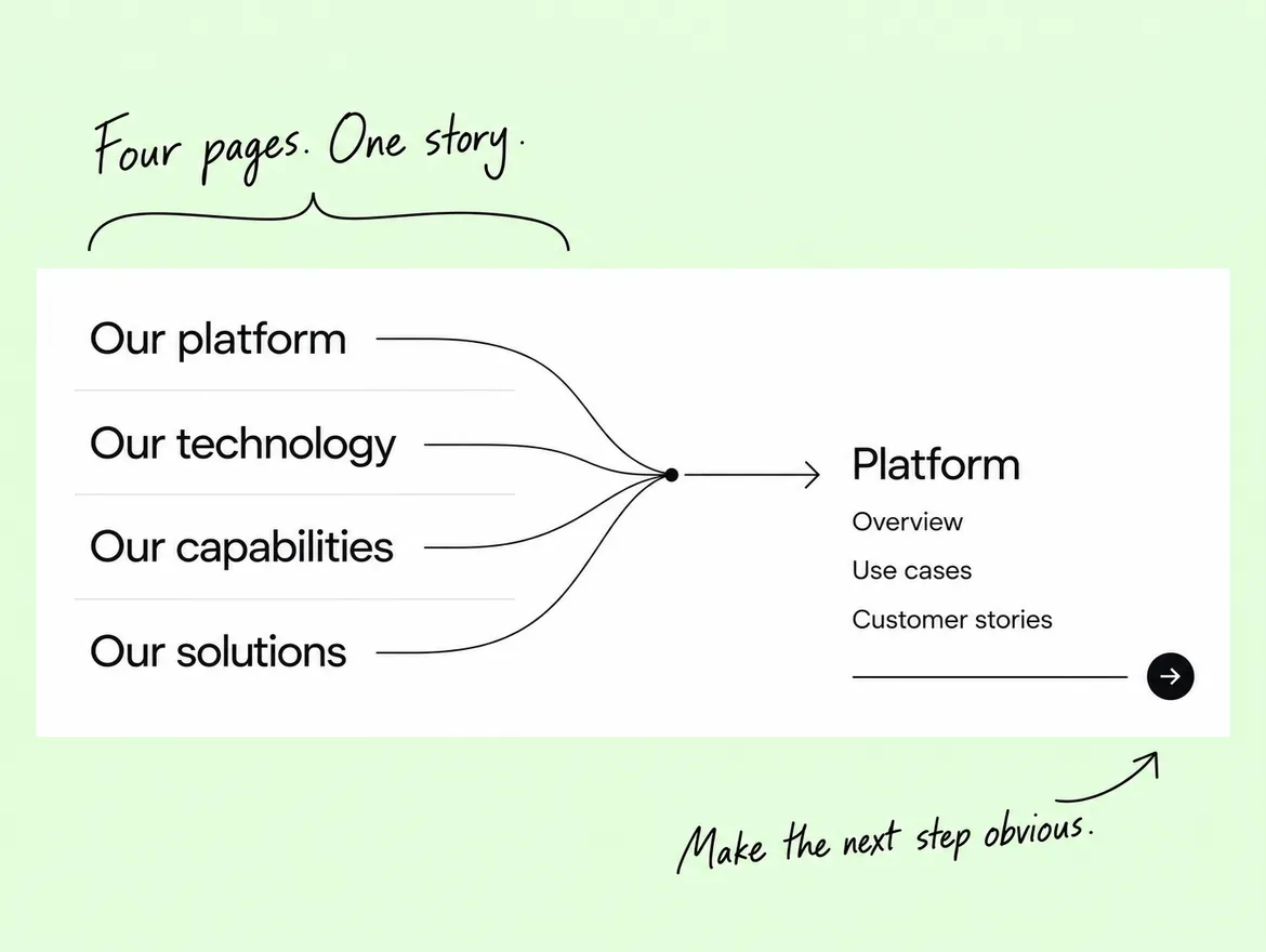
This is the default failure and it is easy to spot: top-level sections named Solutions, Services, Platform and Resources, each owned by a different team, each with its own view of what belongs inside. The names are internally meaningful and externally empty. A buyer cannot tell whether integration documentation lives under Platform or Resources, so they guess. Fixing this is a regrouping, not a rename, which is why it precedes the design.
One branch per segment is the most seductive structure in B2B, because it maps to how sales is organized and it demonstrates well. It works when the segments genuinely buy different things. It fails when they buy the same thing for different reasons: the content then has to exist in every branch, each copy drifts, and a buyer who fits two segments picks one at random. Before committing, check how many pages would need to appear in more than one branch.
Grouping and naming are separate jobs and teams routinely collapse them. You can have the right grouping sitting behind a label nobody recognizes, and the group will go unused. Labels are where internal vocabulary does the most damage, because every company develops words that mean something precise inside the building and nothing outside it.
Named programs, internal codenames and invented category words all behave the same way in navigation: they force the reader to click in order to discover what the section is. One click of uncertainty is survivable at the top level. Three is not. If a label needs a tooltip, it is not a label.
Resources and Insights. Solutions and Services. Platform and Product. Pairs like these usually exist because two teams each built a section and neither would give theirs up. The buyer has no way to tell them apart, so site search becomes the real navigation. Merging them is a content decision, not a copy decision.
Test labels against people who do not work for you. There is a free version worth running first: write each top-level label on its own line, hand the list to someone outside the company, and ask what they would expect to find under each one. Where they hesitate, the label is doing no work.
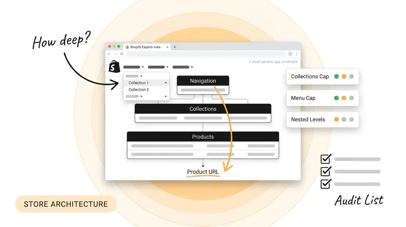
Somewhere in every rebuild, someone says the site should be no more than three clicks deep. It is durable advice with very little published behind it. We have not been able to produce a study establishing URL depth as a ranking factor, and we would not put one in front of a client without being able to hand it over. Treat it as a design heuristic. If someone cites a study, ask for the link before the structure is built around it.
What Google does publish is narrower and more useful. Its URL structure guidance recommends readable words over long ID numbers, hyphens rather than underscores, and as few parameters as a page can manage. It also states that URL handling is case sensitive, so /Solutions and /solutions are two distinct URLs with their own content. And it names parent-relative links as a way to create infinite spaces when a server returns the wrong status for missing pages, recommending root-relative links instead.
So the honest version of the depth argument is this. A page that nothing links to is what hurts you, not the number of segments. A page four levels deep with six internal links pointing at it is healthier than one two levels deep that appears in no menu, no related list and no sitemap entry. Orphans are the real depth problem, and a sitemap diagram shows intent rather than markup.
One practical consequence for anyone building in a CMS: if a listing page renders its tiles only after JavaScript runs, or outputs them with placeholder hrefs, every page behind those tiles is an orphan to a crawler. Check the rendered HTML, not the plan.
Once the grouping is settled, the same model has to appear consistently in several places, and consistency here is a published requirement rather than a preference. W3C’s WCAG 2.2 Success Criterion 3.2.3, Consistent Navigation is a Level AA criterion requiring that navigational mechanisms repeated across a set of pages occur in the same relative order each time.
W3C also publishes a named failure for it. Technique F66 is triggered when a navigation mechanism presents its links in a different relative order on two or more pages. The test is two steps: check whether a navigation mechanism appears on more than one page, then check whether its links sit in the same relative order on each.
The criterion is more forgiving than teams assume. W3C’s note states that secondary navigation inserted between the repeated items does not break it, and an expanding menu is given as a passing example. What must hold is the relative order of the repeated items. Where a menu animates open, the motion should not reorder anything underneath it.
This is the criterion that component-based builds fail by accident. When each template owns its own navigation component, templates drift apart over a year of edits without anyone filing a bug, because each page looks correct on its own. The defense is structural: one navigation component, one source of truth for its order, and a check in the release process. It also reduces engineering dependence over time.
The URL layer should mirror the same grouping. If the navigation says a page belongs under a section, the URL should say so and the breadcrumb should agree with both. Where they disagree the breadcrumb is usually wrong, and a breadcrumb step pointing at a section that does not exist is invalid markup.
Card sorting is how you find out whether your grouping matches anybody else’s. Participants group labeled cards into categories that make sense to them, and the output shows where your model and theirs diverge. The method has a known sample-size answer, which is unusual and useful.
Nielsen Norman Group analyzed a 168-participant dataset from Tullis and Wood and reported that five users give only a 0.75 correlation with the full result, while 15 users reach 0.90 and 30 users reach 0.95. Its recommendation is 15 for most projects and 30 for large, well-funded ones. The shape of that curve matters more than the headline: the move from 5 to 15 buys reliability, and the move from 15 to 30 rarely justifies twice the recruiting.
Card sorting is generative: it tells you how people would group things. It does not tell you whether the structure you built from it works. That is a tree test: give people a text-only version of your hierarchy, ask them to find specific things, and record where they go. Skipping the tree test is the half-measure that lets a flawed structure reach wireframes.
Do both before design, for a purely economic reason. At the card-sort stage the structure is a spreadsheet and changing it costs an afternoon. After wireframes it costs the wireframes. After a build it costs the build, the redirects, and whatever the old URLs had earned. More on running these inside a live project in our writing.
Most real sites end up as a hybrid, and that is fine. What is not fine is choosing a structure by instinct and meeting its failure mode eighteen months later. These are the patterns worth considering and the specific cost each one carries.
|
Structure |
Best suited to |
How buyers find things |
The cost |
|---|---|---|---|
|
Flat |
Small sites, roughly 30 pages or fewer |
Scanning a single menu |
Breaks down as pages grow; the menu becomes unreadable |
|
Department-led |
Intranets and internal reporting |
Knowing which team owns the answer |
Buyers do not know your org chart, so findability drops |
|
Task-led |
Most complex B2B sites |
Recognizing their own problem in a label |
Needs research up front and ongoing label maintenance |
|
Audience-led |
Segments that buy genuinely different things |
Self-selecting into a segment |
Content duplicates across branches and the copies drift |
|
Faceted |
Large, attribute-heavy libraries |
Filtering down by attribute |
Combinable filters multiply URLs and need crawl controls |
The honest reading of that table is that task-led structures suit most complex B2B sites and cost the most to set up, because they need research the other three do not. That is the trade. Audience-led structures are cheap to agree on and expensive to maintain. Faceted structures need crawl controls from the first release, because Google’s URL documentation names additive filtering as a cause of inefficient crawling.
A restructure moves URLs. Moving one without a 301 discards whatever that page had earned, and a 301 into a page that returns a 404 or carries a noindex is worse than no redirect, because it strands both. Map every moving URL to a live, indexable destination before the release, and confirm each with a response-header check rather than by clicking it.
Any filter that can be combined with another multiplies the number of addressable URLs, and each combination is a URL a crawler may fetch. If your new structure introduces filtering, decide the crawl controls in the same release, not in a cleanup sprint six months later when the pattern is established.
Structures decay the same way every time. A team needs a page, no existing section quite fits, so a new top-level item appears. Two years of that and the navigation is back to the org chart. The fix is a written rule covering which container a new page belongs to and who approves a new container. You can see how that plays out across a body of work in our case study library.
If you are rebuilding a site under about thirty pages, this is a week of work: list the decisions, group the content, name the groups in words your buyers use, and move on. If you are rebuilding something larger, the sequence matters more than the output: decisions, then grouping, then labels, then a card sort, then a tree test, then wireframes. Teams that design first and structure afterward pay for the same work twice. And if the site is already live and already struggling, resist the full rebuild: fix the labels, fix the navigation order, and fix the orphans first, because those three are cheap and they tell you whether the structure underneath is sound. If you want a second opinion on yours, talk to us.
Q: How is information architecture different from navigation design?
A: Information architecture decides what content exists, how it is grouped and what each group is called. Navigation design decides how one of those groupings is presented on screen. The same architecture can be rendered as a mega menu, a sidebar or a search-led interface. If you change the menu without changing the grouping, you have redecorated; the buyer still cannot predict where anything lives.
Q: How many people do we need for a card sort?
A: Nielsen Norman Group recommends 15 participants for most projects, on the basis that 15 reaches a 0.90 correlation with a full study while 30 reaches 0.95. Five is not enough; it correlates at only 0.75. Recruit from people who resemble your actual buyers rather than colleagues, and if your buyers split into genuinely different groups, run a separate sort for each rather than mixing them.
Q: Does a deeper URL structure hurt our rankings?
A: We cannot point to a published study establishing URL depth as a ranking factor, so we will not claim one. What is well documented is that pages nothing links to perform badly, and depth and orphaning often travel together. Before restructuring for depth, run a crawl and find the pages with no internal links pointing at them. That list is usually the actual problem.
Q: Should we organize by audience or by what we do?
A: Organize by audience only when your segments buy genuinely different things. If they buy the same thing for different reasons, an audience-led structure forces you to duplicate content across branches, where the copies drift apart. The test is simple: list the pages that would have to appear in more than one branch. If that list is longer than two, group by the decision being made instead.
Do we need a US-based team for this work?
A: Not for the structure itself, which is research and judgment rather than geography. Whether you are comparing Webflow design services in United States markets or working with a studio elsewhere, the test is the same: ask to see the card sort data, the tree test results and the redirect map, not just the final sitemap. A team that cannot show you those three worked from instinct.
Q: What is the cheapest fix if we cannot rebuild right now?
A: Three things, in order. Rename any top-level label that needs explaining. Make the repeated navigation appear in the same relative order on every template. Then find the orphan pages and link to them from somewhere that makes sense. None of those requires a new design, all three are measurable, and together they tell you whether the grouping underneath is worth keeping.
Let’s Connect.
Have a project in mind or want to explore how we can help your business grow?