
September 6, 2022
The Ultimate Guide to Building a Website Redesign Strategy.
Read Full


Table of contents

A redesign can launch looking better, test better in the boardroom, and still lose the company money. That's the part nobody prepares you for, because it breaks the story everyone tells: old site looks dated, new site looks modern, modern converts better. Sometimes that's true. More often, the company that approved the new design is the last one to understand why it isn't working. This is about the gap between "design approved" and "live, working, and measured" and the handful of things that usually fail inside it.
A redesign doesn't fail because the visuals are wrong. It fails because three separate systems strategy, search authority, and approval quietly disconnect somewhere between the design file and the live server, and nobody is assigned to watch all three at once. McKinsey's research into organizational transformation found that roughly 70% of these projects miss their goals for reasons of strategy and alignment, not execution. A b2b website redesign is a smaller version of the same pattern: the design team can execute a flawless brief and the project still fails, because "fail" doesn't mean the site broke. It means nothing measurable got better.
Most of what follows traces back to decisions nobody treated as decisions at the time: a URL simplified without a redirect, a stakeholder who acted with authority he never formally had, a content deadline that slipped until a designer filled the gap with filler copy. None of that shows up in a Figma file. All of it shows up in week six. You can see examples of this kind of recovery work in our project work, where most of the fixes were operational, not visual.
Before design starts, somebody should be able to state the business problem in one sentence that isn't "it looks dated." A real problem sounds like: not enough qualified leads, visitors bouncing before they understand what you sell, or sales reps who avoid sending the site to prospects because it doesn't support the pitch.
The diagnostic question almost nobody asks out loud is which of three problems you actually have: traffic, conversion, or credibility.
If you can't name which of these three you have before the kickoff call, the redesign is a guess with a budget attached. This is also the point at which it's worth being honest about whether the site is even the constraint. Pricing, product fit, or a broken sales process can look exactly like a "website problem" from the outside, and a redesign will not fix any of them. Our team has more on this diagnosis step in more redesign breakdowns, if you want to see how other teams have scoped the same question.
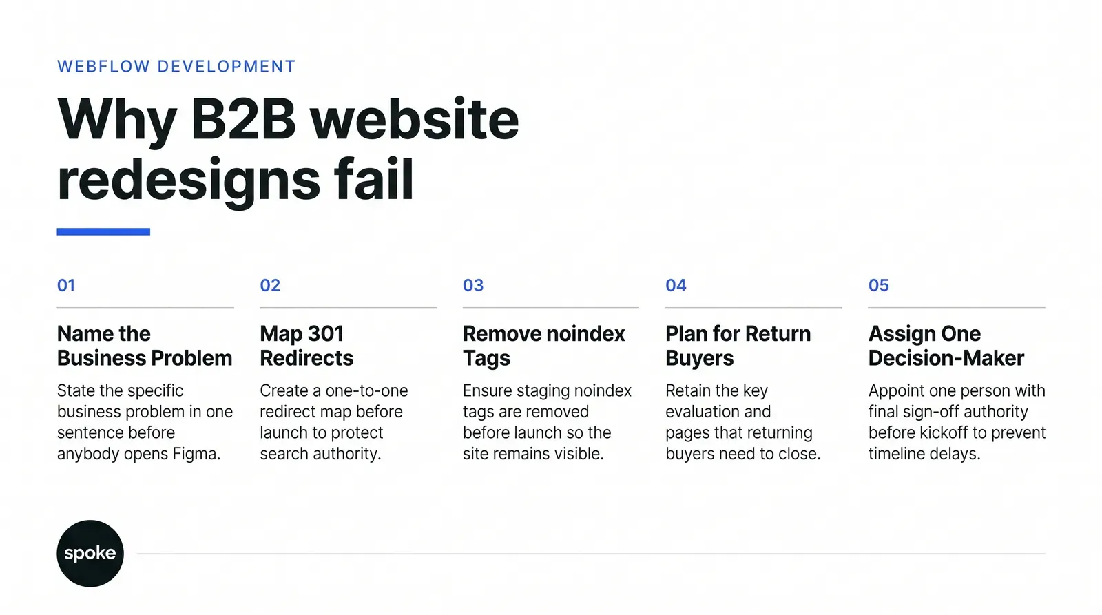
This is the most expensive mistake and the most preventable one. Somewhere between design sign-off and launch day, someone decides to simplify the URL structure dropping "/blog/" for "/posts/", flattening a nested product taxonomy. In a meeting it reads as a UX improvement. Without a one-to-one redirect map, it's invisible ranking destruction.
Google's own documentation confirms a correctly implemented 301 doesn't cost you PageRank, which is why the Google SEO starter guide is worth reading before this phase starts, not after. The failure isn't the redirect rule, it's that mapping work gets treated as a line item instead of infrastructure. A bulk redirect to the homepage reads as a soft 404 to Google, and the ranking signal never transfers. A common shortcut: redirecting everything without an obvious new home straight to the homepage, because mapping 400 individual URLs feels slow.
The highest-ROI hour on any redesign is spent here, and it follows a fixed sequence:
Something in that mapping will fail somewhere. It happens on almost every migration. The distinction between a 301 and a temporary 302, explained in MDN's HTTP redirect reference, matters more here than most teams realize, since a 302 signals the move isn't permanent and search engines treat it differently.
A quieter version of the same failure: a noindex tag built for the staging environment gets carried into production. The site goes live looking perfect and is invisible to Google for weeks, because a tag meant to keep a staging copy out of search results was never removed. It's a five-minute check. It's also one of the most common reasons a launch that looked clean on day one looks like a disaster three weeks later.
A small dip after launch is expected. Google has to recrawl and reindex the new structure, and a modest drop under roughly 10% for a couple of weeks is the normal cost of that process, not evidence that something's wrong. The mistake is treating every dip the same way: panicking over normal reindexing, or dismissing a genuine collapse because "dips are normal."
The distinction that matters is magnitude and duration, not the fact of the dip itself. A drop closer to 40%, or one that doesn't start recovering within a few weeks, is not Google catching up; it's a specific, fixable problem: a broken redirect chain, a robots.txt block, stripped metadata, pages that lost their internal links. UX researcher Jared Spool documented a redesign where sales dropped 20% at launch and took three and a half years to recover, which is the version of this story that should make any stakeholder take pre-launch validation seriously rather than treating it as a formality.
Set monitoring up before launch, not after. Baseline your organic traffic, lead volume, and rankings for your top pages, and decide in advance what counts as acceptable fluctuation versus an incident. Without that baseline you can't tell normal from broken, and by the time it's obviously the second one, you've lost weeks you didn't have to lose.
This surprises people, but it shouldn't. Marks & Spencer redesigned its site to look sharper and saw an 8% drop in online sales, because the sleeker interface was harder for existing customers to navigate than the one it replaced. Separate research from the Nielsen Norman Group on how people adapt to interface changes helps explain the mechanism the usability research on interface change shows familiarity is itself a form of usability, and asking people to relearn something automatic has a real, measurable cost.
Two mechanisms are at work, and most teams only guard against one. The first is interface friction: moved navigation, new iconography, a structure that used to be instant and now takes a second longer. Some of this recovers as users adapt. Some don't, because the new structure is genuinely worse, just newer-looking.
The second is quieter and does more lasting damage. Copy gets cut in the name of clean design. A paragraph that answered "what do you do, who's this for, why you" gets trimmed because it made the page feel busy. The page looks better in a screenshot and converts worse, because the visitor can no longer answer the question that used to close the deal. Nobody signs off on "make our product pages less informative" it happens one editing pass at a time.
Performance follows the same arc. Parallax, full-screen video, animated transitions photograph well in a pitch deck and add load weight that shows up directly in Core Web Vitals scores, which is why Core Web Vitals guidance from web.dev belongs in the design brief, not the developer handoff. Page speed is a ranking factor and a usability factor at once, and it needs a budget set before design starts, not discovered in week eight when a developer flags it.
Design-led decisions and performance budgets have to be set in the same meeting, which is one reason our Webflow design process bakes a load-time limit into the brief itself.
Most redesign projects implicitly optimize for a first-time visitor landing on the homepage. That's reasonable for a consumer brand. It's often the wrong target for a b2b website redesign, where a meaningful share of valuable traffic is returning a buyer three calls into a sales cycle rereading the pricing page, or a technical evaluator pulling up the integrations page before procurement signs off.
A redesign built entirely around first impressions tends to bury exactly the pages that close deals: the detailed comparison page, the ROI calculator, the case study a rep has been sending to prospects for two years. Designers rarely know these pages exist because sales isn't in the kickoff room, and by the time the team notices their highest-performing closing page has been quietly simplified into something vague, the site is already live. If more than one buying persona touches your site at different depths of the sales cycle, a single polished path for a cold visitor underserves everyone who isn't one. Get the names of the five pages sales actually sends out, and protect their function as a hard requirement.
At a company of fifty or more people, a redesign has a marketing sponsor, a sales stakeholder with opinions about specific pages, a product team worried about onboarding, sometimes legal or compliance review, IT who own hosting and DNS and get looped in two weeks before launch, and an executive with a late, strong opinion about whitespace. None of that is unusual.
What actually causes delay is the absence of a documented answer to one question: when two of these people disagree, who decides, and what evidence settles it? Without that answer, feedback cycles stretch for weeks, the project drifts past scope because every disagreement becomes a reason to add an option instead of choosing one, and timelines routinely extend 30 to 50% once multiple stakeholders start iterating without a tiebreaker. This is why our own web design and development process puts a single named decision-maker in writing before a kickoff call happens, not after the third round of revisions.
Design rarely blows the deadline. Content does. Copy is due the same week as launch, the person responsible for it has a day job, and a designer under pressure fills the layout with placeholder text that quietly becomes final. Pages get written to fit a box instead of to answer a buyer's question, and the site launches saying less than the old one did. Staffing content with the same seriousness as design, starting on day one rather than after design wraps, is the single cheapest fix on this entire list.
Not every underperforming site needs a rebuild. If the current site works reasonably well and the complaint is mostly "it looks old," a full redesign solves a problem you don't have while introducing several you do. A cosmetic refresh on the existing platform, with the same URLs and navigation, carries almost none of the SEO risk a full migration carries.
|
Redesign type |
Risk to traffic and rankings |
Time to launch |
Cost range |
Right fit when your problem is... |
|
Cosmetic refresh, same CMS and URLs |
Low |
2–6 weeks |
Lowest |
The site works fine but looks dated |
|
Full redesign with CMS migration |
High |
12–24 weeks |
Highest |
The platform itself is the constraint |
|
Phased launch, top pages first |
Moderate |
8–16 weeks |
Mid-high |
You need lower risk on a full rebuild |
|
Growth-Driven Design, continuous releases |
Low per release |
Ongoing, no big launch |
Mid, spread over time |
You want change without a cliff-edge |
|
Targeted optimization, no rebuild |
Minimal |
1–4 weeks |
Lowest |
Specific pages underperform, structure is fine |
A full redesign with a CMS migration is justified when the platform itself is the constraint you can't ship content fast enough, or technical debt is compounding faster than it can be patched. Bundling a migration with a visual overhaul multiplies risk; each alone is manageable, and both together is where most of the failure modes above compound on the same launch day. Teams considering this route often bring in dedicated Webflow build work early, specifically so the redirect mapping and the design work don't get scheduled by the same person under the same deadline.
If your site has little organic traffic worth protecting, the redirect and URL-preservation advice here matters far less there's less ranking equity to lose, and more freedom to restructure aggressively. If a high-ranking page is a legacy product sales wants retired anyway, preserving it for traffic you can't monetize is its own mistake. And if your company is small enough that the CEO and the designer are the same two people with no formal approval chain, the governance advice above is overkill; the real risk at that size is usually indecision, not conflicting authority.
A b2b website redesign succeeds when the business problem is named before the project starts, the SEO equity is mapped before new URLs go live, and someone with real authority is ready to make the calls nobody wants to make. If your current site converts reasonably and just looks tired, optimizing it a full rebuild will cost more than it returns. If the platform itself is holding you back, plan the migration and the visual work as two risks, not one, and budget for webflow development USA capacity that's handled a redirect map before.
Everything else, the font, the layout, the whitespace was never actually at risk. If you want a second opinion on which problem you're actually solving, get in touch and we'll tell you honestly whether you need a redesign at all.
Q: We redesigned our site and it looks amazing but leads dropped 40%. What went wrong?
A: A drop that large is not normal reindexing; it's a specific, fixable bug. Check for broken 301 redirects, a noindex tag carried over from staging, or a bulk redirect to the homepage that Google is reading as a soft 404. Crawl the live site, compare it to your pre-launch URL map, and fix the gap rather than waiting for recovery.
Q: What's the difference between a site that needs a redesign and one that just needs optimization?
A: A site needing optimization works reasonably but has specific weak pages, slow load times, or outdated messaging. A site needing a full redesign has a structural constraint: the platform can't support new content types, or the architecture itself blocks growth. If the complaint is mainly "it looks old" and performance is fine, optimize first.
Q: Do we have to accept a traffic dip after launch, or is that a sign we screwed up?
A: A small dip, under about 10% for a couple of weeks, is normal while Google recrawls and reindexes the new site. Anything larger, or anything that doesn't start recovering within a few weeks, points to a specific technical problem rather than normal fluctuation. Set a baseline and a threshold before launch so you can tell the two apart quickly.
Q: We have three executives with conflicting opinions on the redesign. How do we not let this kill the project?
A: Name one person with final sign-off authority before the kickoff call, not during the fourth round of revisions. When opinions conflict, settle it with data test results, sales feedback, heatmaps rather than seniority. Without a documented tiebreaker, feedback cycles stretch for weeks and scope creeps as every disagreement becomes a new option instead of a decision.
Q: Our old site has years of ranking authority. How much of that will the redesign destroy?
A: That depends almost entirely on your redirect mapping, not your design. A one-to-one 301 map preserves nearly all of it; a bulk redirect to the homepage or missing redirects can erase it within weeks. Export every indexed URL, flag the ones with real traffic or backlinks, and map each individually before a line of new code ships.
Q: SEO says we have to keep pages we want to remove because they rank. Do we really have to?
A: Not always if the page is a legacy product or process the business genuinely wants to retire, keeping it for traffic you can't monetize is its own cost. In that case, redirect it deliberately to its closest living equivalent rather than deleting it outright, so you capture some of the ranking value without carrying dead weight.
Q: When does a modern CMS migration actually add value versus just add risk?
A: It adds value when the current platform is the actual constraint you can't publish fast enough, or technical debt is compounding faster than your team can patch it. It adds risk, without much upside, when the platform works fine and the real complaint is visual. Bundling a migration with a cosmetic refresh multiplies risk for little added benefit in that case.
Have a project in mind or want to explore how we can help your business grow?